Coral Crusaders
Coral Crusaders is a company idea I came up with devoted to educating people about the destruction of corals and the importance it has on our society. This idea came after a night of binge watching a show on Netflix titled ‘Chasing Coral.’
The Mission
The mission is simple: document coral bleaching events through high quality video and photography to increase awareness, and allow those who cannot see in real time to digitally witness and comprehend the consequences that global warming is causing upon our coral reef ecosystems.
Moodboard
The moodboard process helped me to come up with a gameplan and ideal brand image to move forward with. Colors, level of simplicity, scalability, and more all became focal points at this stage. Scalability was a bit rough, as coral can naturally be so detailed. Deciding how detailed to go while preserving the ability to scale the logo down to a very small size was a very fine line.
Ideation
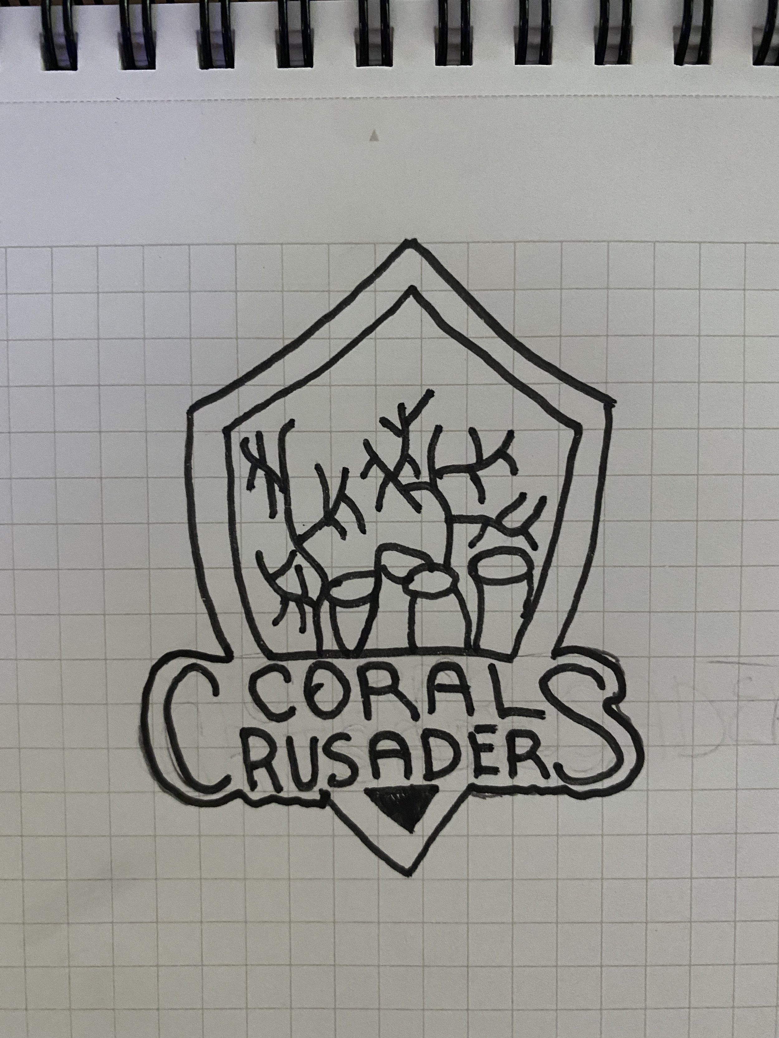
Beginning with the sketches, my ideal logo consisted of a few components. Coral (obviously), the type, and a shield. With Coral Crusaders ideally being leaders in the fight to save our coral, a traditional shield shape was the flare this brand needed to really demonstrate that every member will be on the “front lines” of this cause.
Concepts
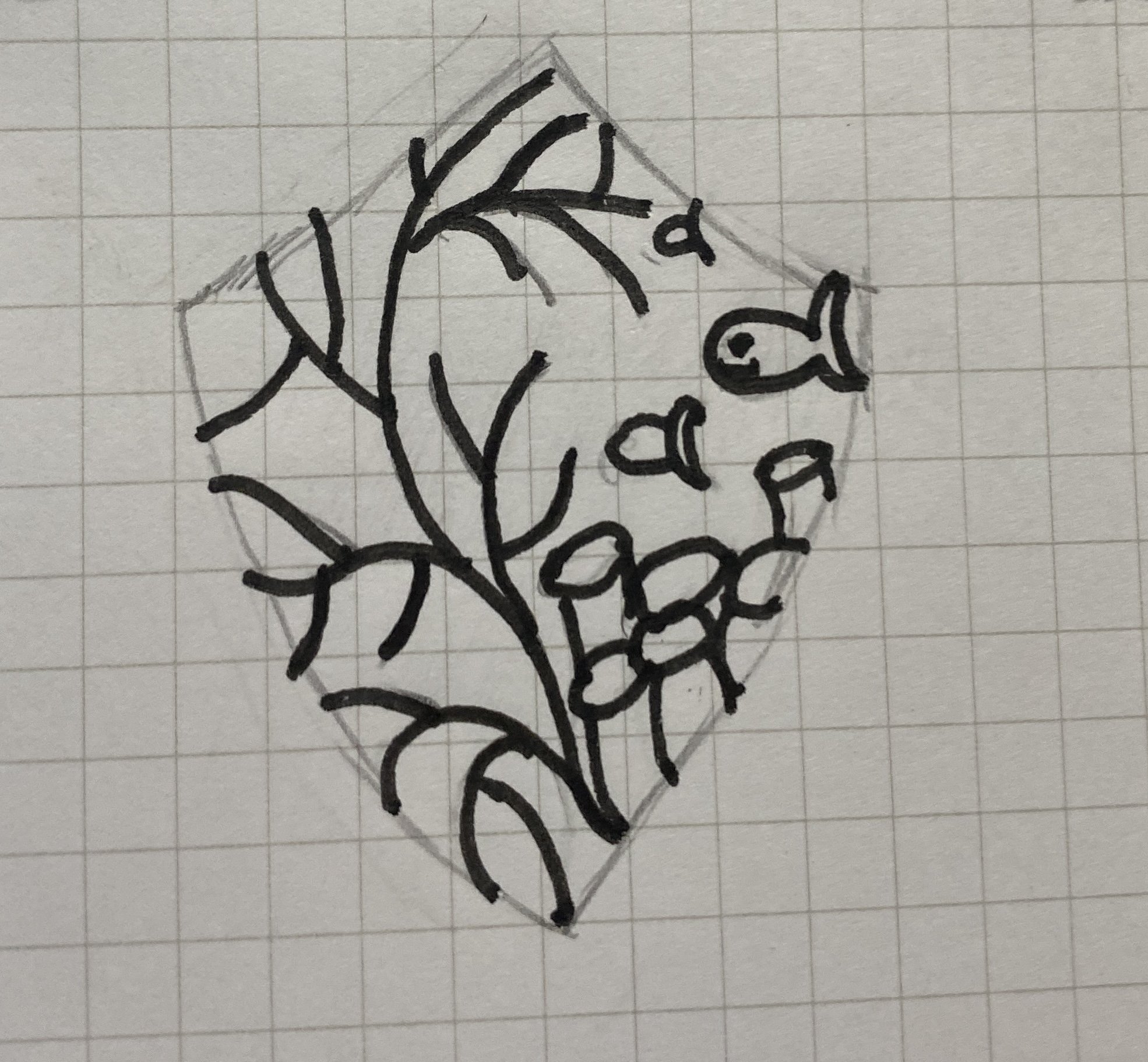
These are the concepts created for the brand. The first one felt way too detailed, but I love to start projects a little balls to the wall and reel it back as needed. Of these concepts, the middle top one stuck out to me most. From here, I worked to refine that version.
Zeroing In
When it came time for the refining the concepts, I decided that although the shield was pronounced, it felt too pronounced. I decided to remove the shield outline, and allow the shape itself to do the talking. To me, this was it. The coral is pronounced, the scalability works, and the shield still feels present but subtle.
Final Look
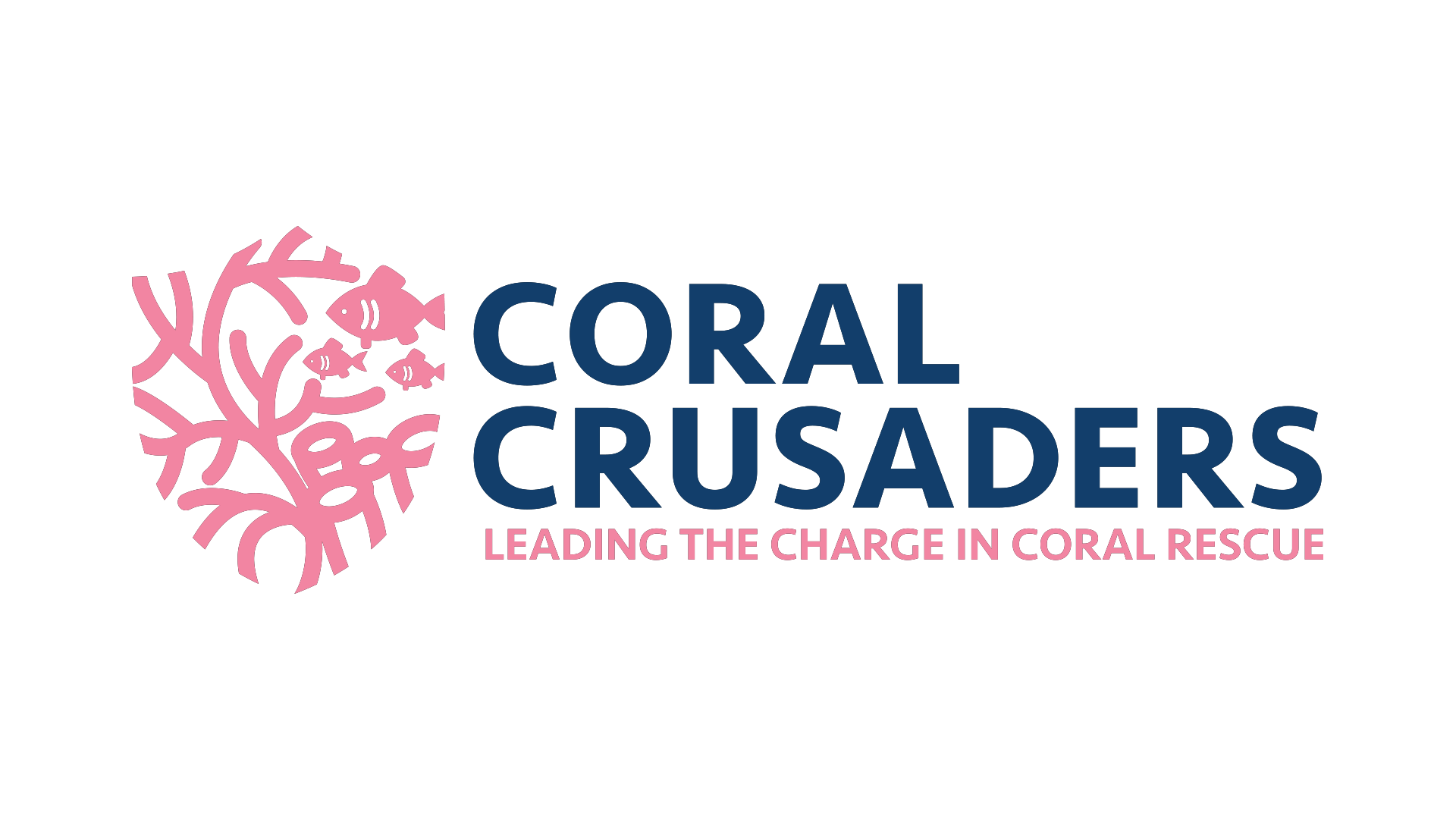
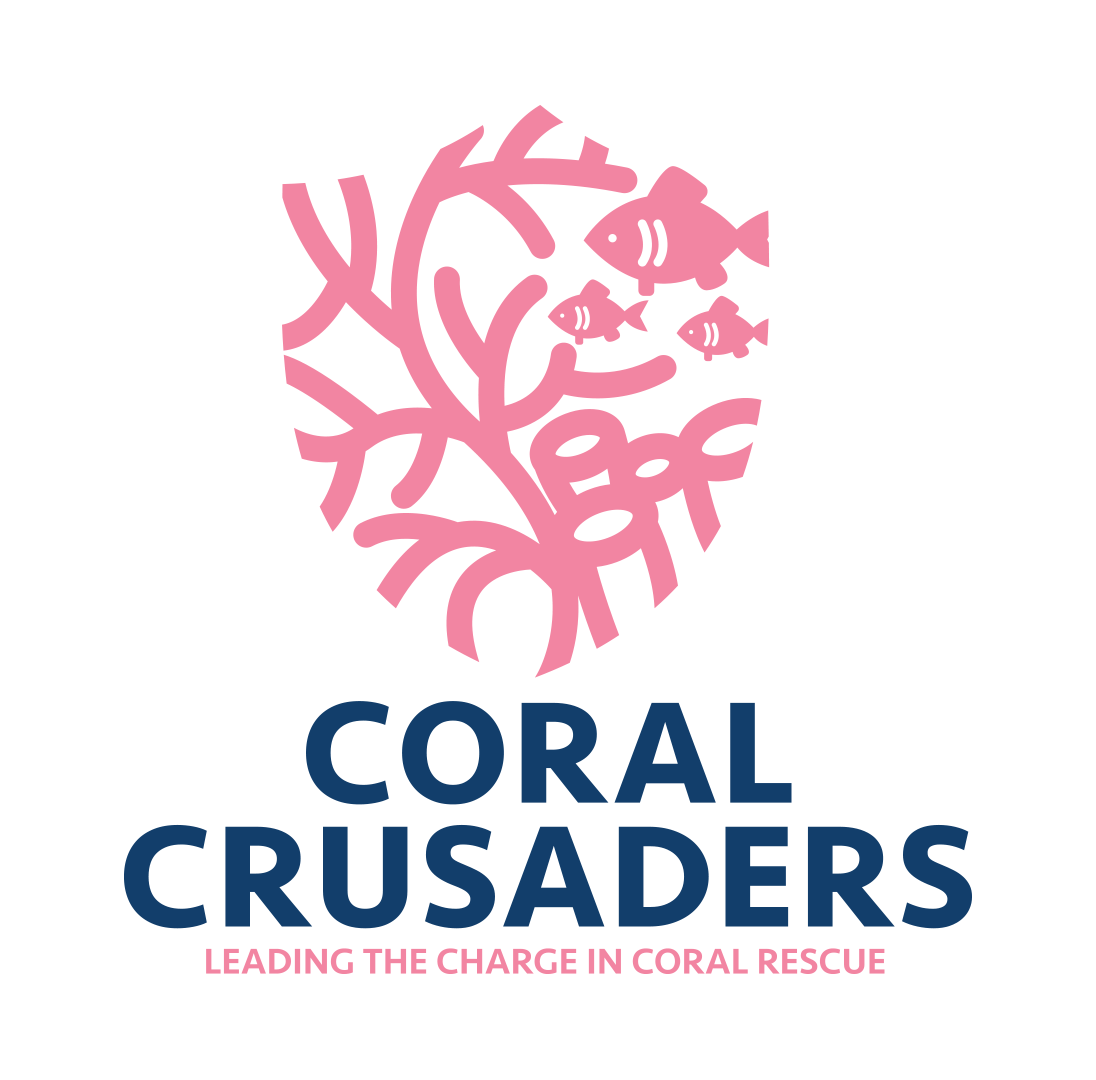
For the final look, the colors were really the last step to tackle. Personally, I find it very important to leave color until last, as the base of the logo must be good enough without color before introducing any vibrancy. For the colors, a brighter pink and darker blue were the choice. The brighter pink portrays not only the traditional color of coral, but also a sense of friendship and passion, two leading traits of the Coral Crusaders. The darker blue demonstrates the knowledge and power we as people can use to our advantage to help save our coral.


