Basics Clothing
Basic. Comfortable. Built to survive. The idea behind Basics is to be at the top of oceanic sporting apparel and equipment. The apparel is built to survive the toughest of conditions on the water, while putting emphasis on comfort, style, and safety.
Background
Basics Clothing started as a practice exercise for business development & brand identity. The idea; durable, safe, and breathable action sports products specializing in oceanic elements . Surf boards, swim suits, inflatable wet suits for those heavy surf days — everything built to last. The logo and products must demonstrate power, sleekness, and simplicity. Although basic in appearance, the quality should be anything but basic.
Initial Sketches
The initial sketch phase presented me with many different directions I could take this project in. In the end, the sketch below is what felt the best. While the custom type feels powerful, the sleek corners and rounded bases allow for it to have some flow to it.
Final Look
With a flowy wave icon, and a blockier font, the logo clashes very similarly to a harsh wave. Although both clash, they ultimately create a powerful end result.
For the icon specifically, I utilized the golden ratio. You will learn more about the golden ratio in my Wildthings project! The colors chosen are light, misty, and almost appear as sea foam — perfect for those tropical areas!
Clothing Tags
Clothing tags were created for Basics as well following the newly established branding. Tags for men, women, and unisex options were created.
3D Landscape
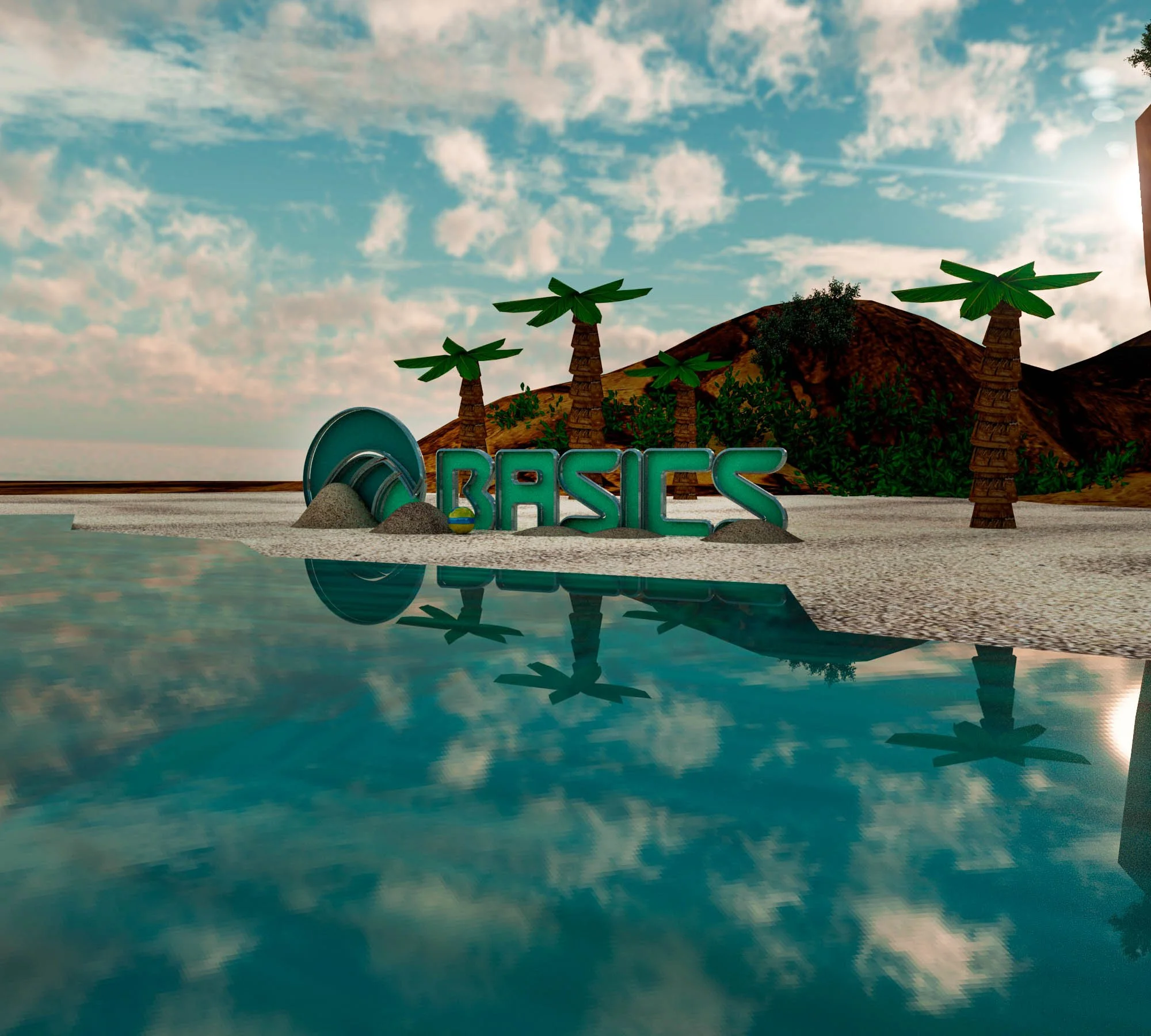
This part of the project came a bit later on during a 3D class in college. We were asked to take a past branding project, and create a 3D scene surrounding it. I instantly thought of using Basics, and creating a beach scene featuring the logo.


